OTR
Grotesk
Animation by ROLI Deluxe
MzType
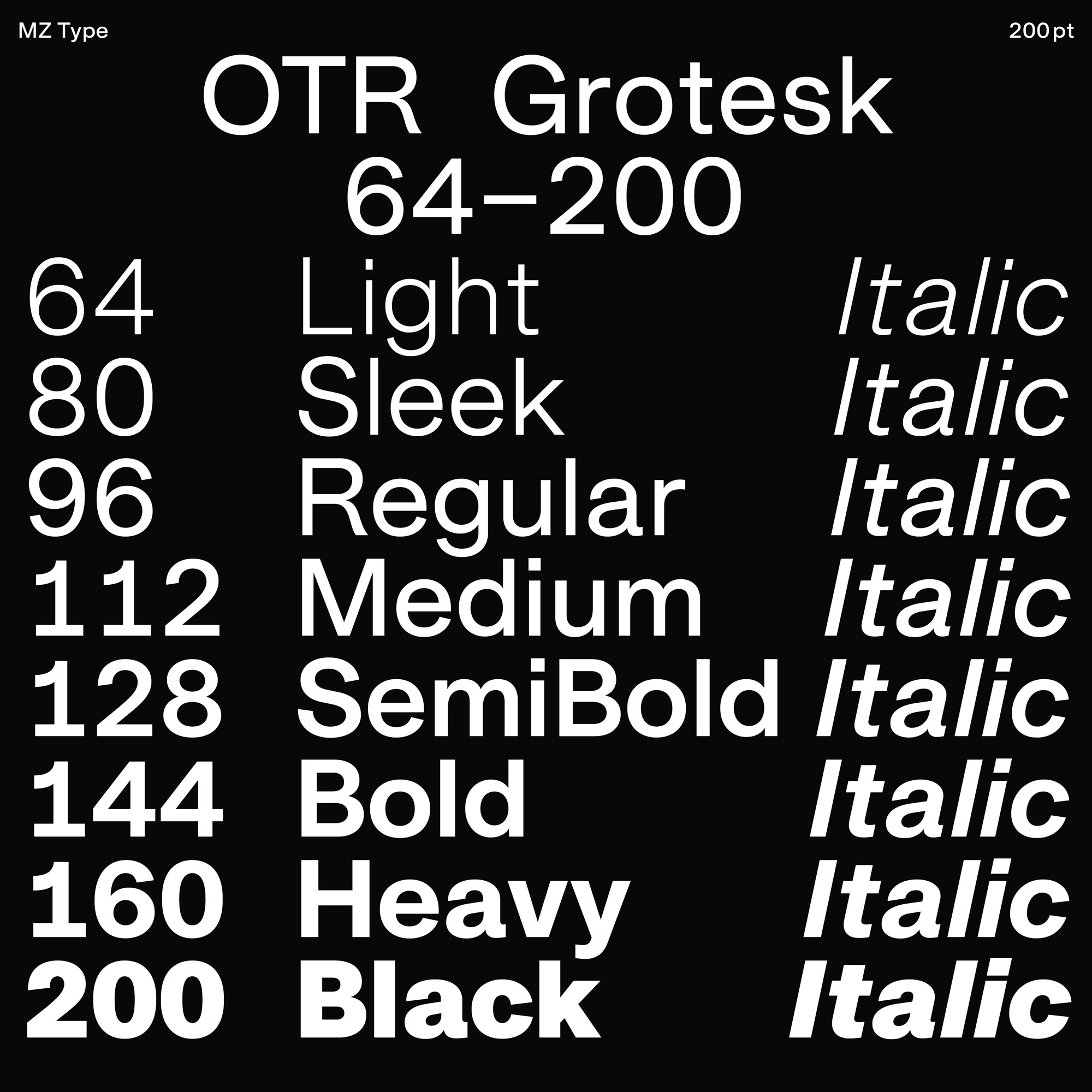
OTR Grotesk
64–200
Writing is language, and typefaces transport information. In my daily work as a graphic designer, I strongly focus on typography, and OTR Grotesk is the result of an urge to get a better understanding of its fundamentals. Since drawing my first letterforms in 2019 the typeface has grown into a complete variable typeface family.
This specimen aims to give an insight into the design principles and to highlight some features.
All styles can be purchased on the corresponding web shop:
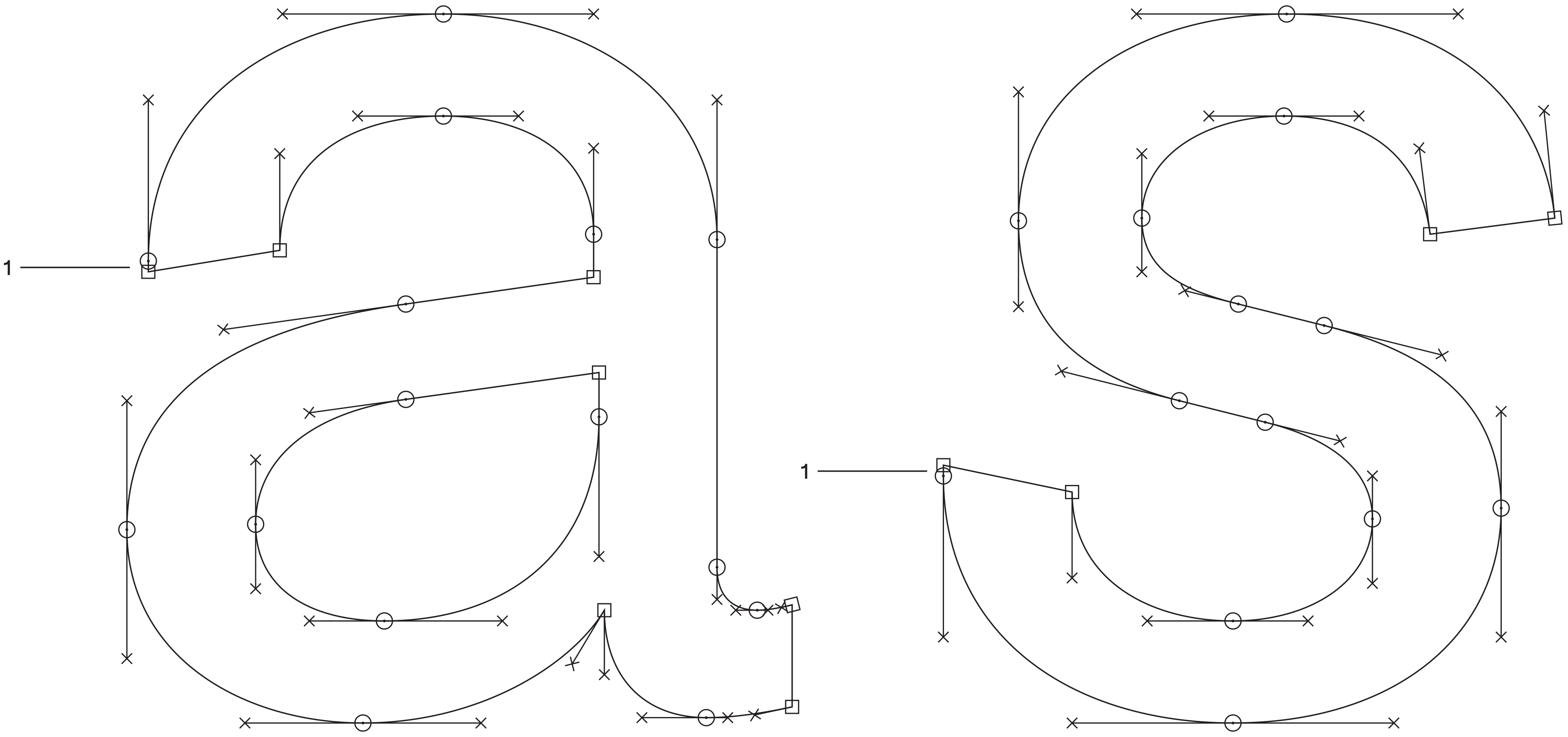
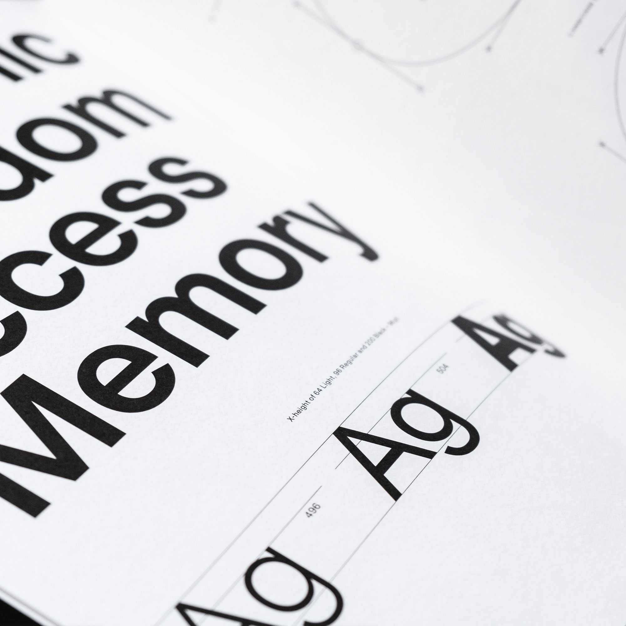
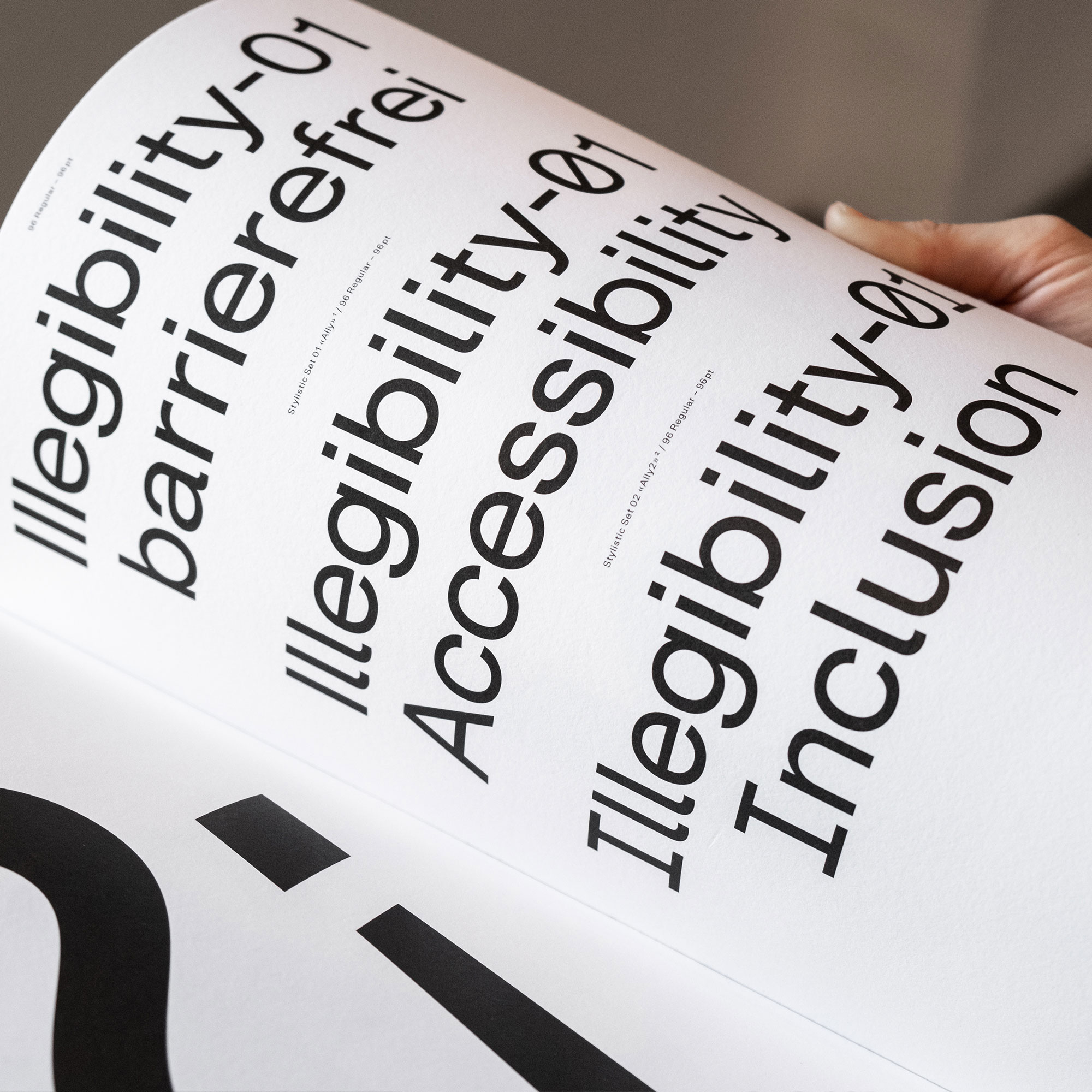
It has always been the intention to design OTR Grotesk to become a workhorse that performs well in a broad range of applications. The tall x-height, generally wide glyphs, and loose spacing allow for great readability at small sizes. The initial design of OTR Grotesk on the other hand experimented with reducing gaps of white space between characters to look tight in display sizes as well as logo design. Together with the idea of finding a formal language that allows glyphs to be very round, this resulted in overhanging terminals of certain curves (e.g. in a and s).
A very pragmatic way to design the overhanging terminals was eventually found in elongating the extrema of the curves into a straight Design line, which works well in all weights and even slanted glyphs.¹.
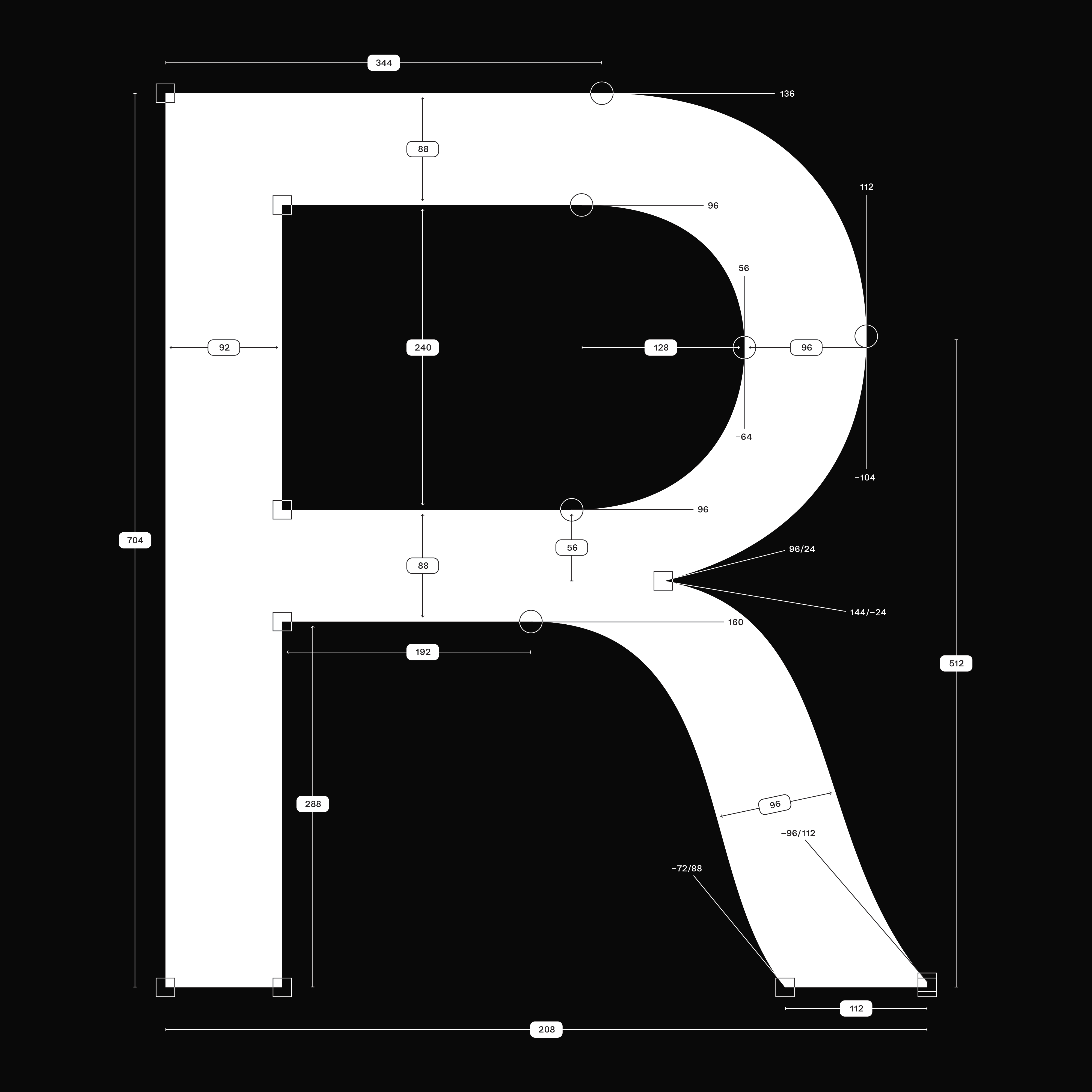
Construction of
Uppercase R
The number 8 is a well-known unit in screen and UI-design, as it provides a perfect base for scaling in both directions without leaving blurred pixels. What applies to screens also works for other design systems in general and is my go-to option for basically everything I design.
In type design there are various scenarios where this approach comes in handy, such as spacing and scaling glyphs for symbols or inferior/superior numbers and denominators/nominators. As far as my testing goes, this doesn’t affect the sharpness of a typeface itself on a screen, as multiple factors such as hinting and device resolution come to play.
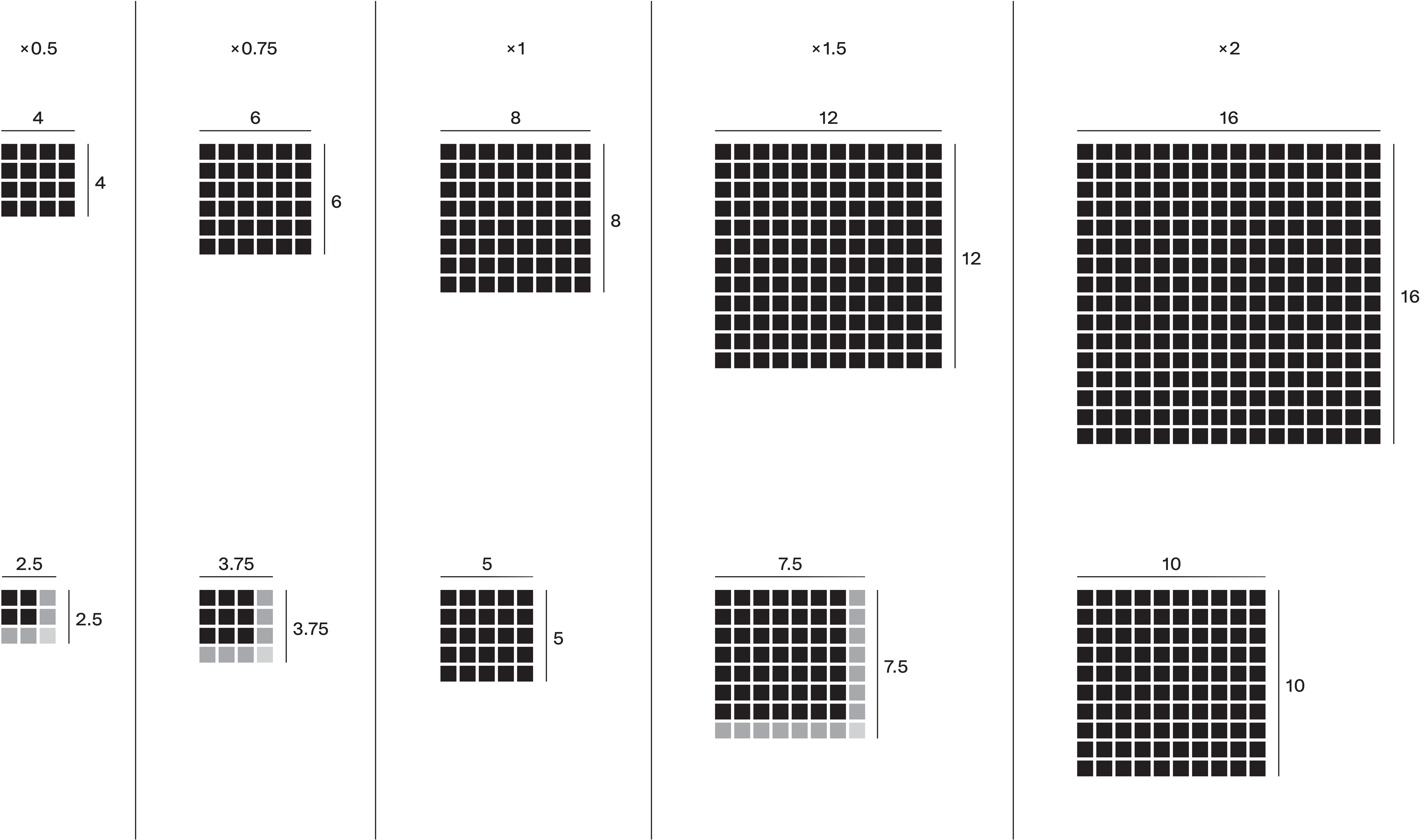
The underlying structure of OTR Grotesk follows a very strict grid – based on the unit 8 – for everything from sizes and spacing to interpolation. Thus, also the generated font styles of OTR Grotesk are almost linear and range from 80 Light to 200 Black. While the classic approach, to distribute the weights nonlinear along the axis, creates a more balanced rhythm between each font style, I sometimes miss more subtle leaps between Light and Medium styles. This fact and the soon-to-be-commonplace variable fonts technique, which allows to seamlessly choose every weight on the defined Weight Distribution range, supported me in this decision.
Animation by Corinne Hirter
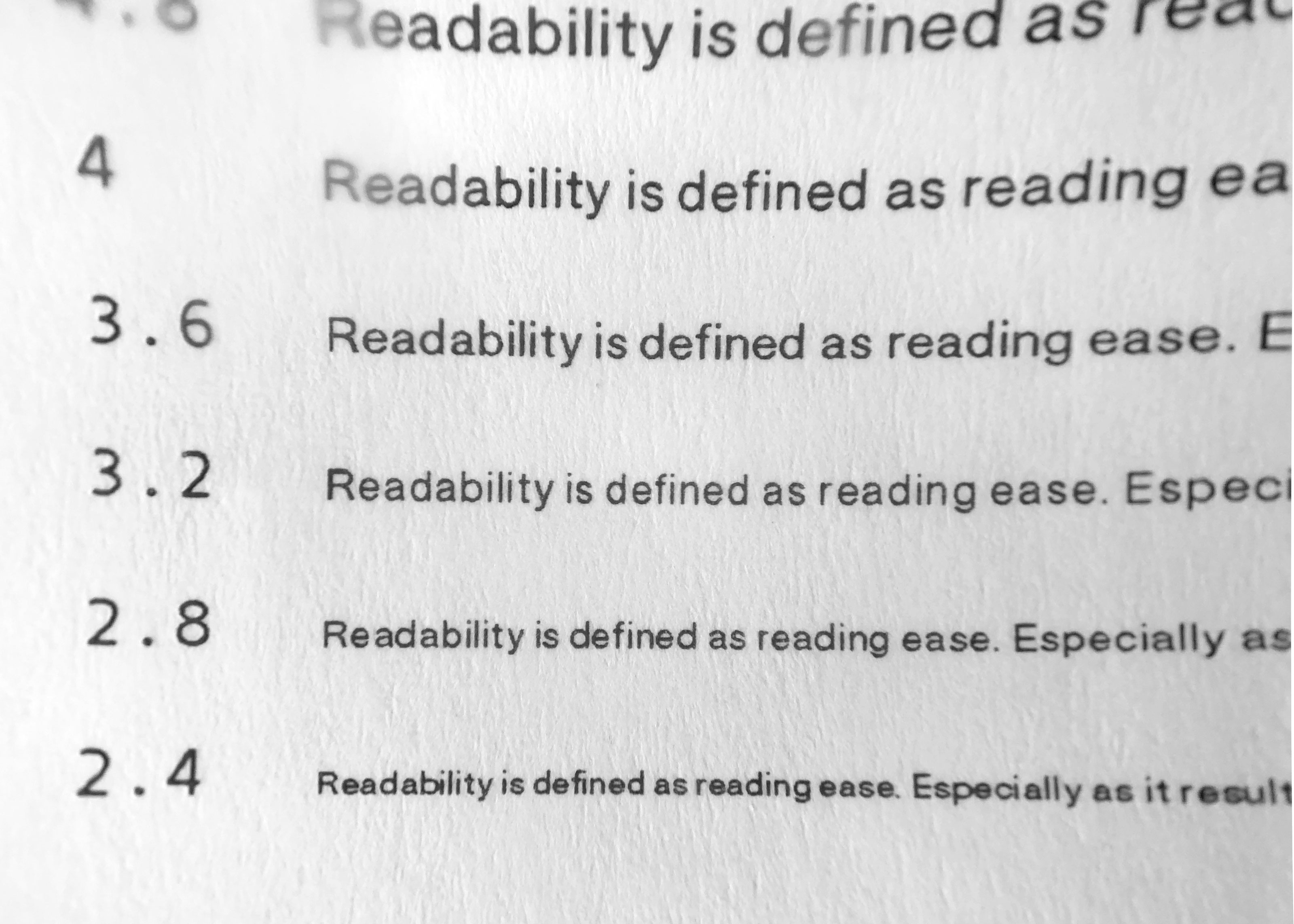
Readability tests on super small sizes.
Picture taken with an 8× magnifying glass, sizes in points.